Tonelab
A reference library of how brands communicate
Brand inspiration library
Overview
How it started ….I was looking into taglines for a friend’s business, just collecting examples from different brands and seeing how they write and communicate. Every time I found a tagline I liked, I’d try writing a variation that matched the tone he was going for.
I started organizing them by industry. I’d look at how a brand speaks, then write a version next to it that fit what we needed. Sometimes I’d add their mission or messaging too, just to understand the voice behind the words better.
Eventually moved everything to Notion to keep it organized. That’s when I started noticing patterns – how different industries use tone, structure, word choices. I liked the idea of turning it into something with cards and tables, easier to search through and build on.
Then I just kept adding more brands because it was useful to have all these examples in one place.
Product Overview (Dark Theme)
Product Overview (Dark Theme)
WHAT IT IS
An inspiration library where you can see how 250+ brands communicate. It’s aesthetically pleasing – you can see logos, colors, taglines, and some basic information about their messaging approach.
I started with around 20 brands. Then somehow I had 50. Then 100. Now there’s over 250 in here. Each brand has its own card showing their tagline and some insights about how they communicate – the tone they use, whether they ask questions or make statements, that kind of thing.
It’s not comprehensive research inside each brand card – just a nice way to browse through brand examples when you want inspiration.
HOW I BUILT IT
Started with Google Sheets – just headers and rows with brand names, taglines, industries, whatever I could find. But sheets get messy fast when you have 200+ rows.
So I moved everything to Notion. When I tried viewing it as cards instead of a table, I really liked how it looked – brands arranged next to each other with their logos and colors visible. Much more appealing than a spreadsheet.
The card format just made sense:
view the zoom video below to know what i mean
- Easy to scan through quickly
- Brands look nice next to each other
- You can see logos and colors
- More engaging than a list
- Even if you’re not looking for something specific, you might find something interesting
Zoom in & out
Browser zoom in for detail, zoom out for overview.
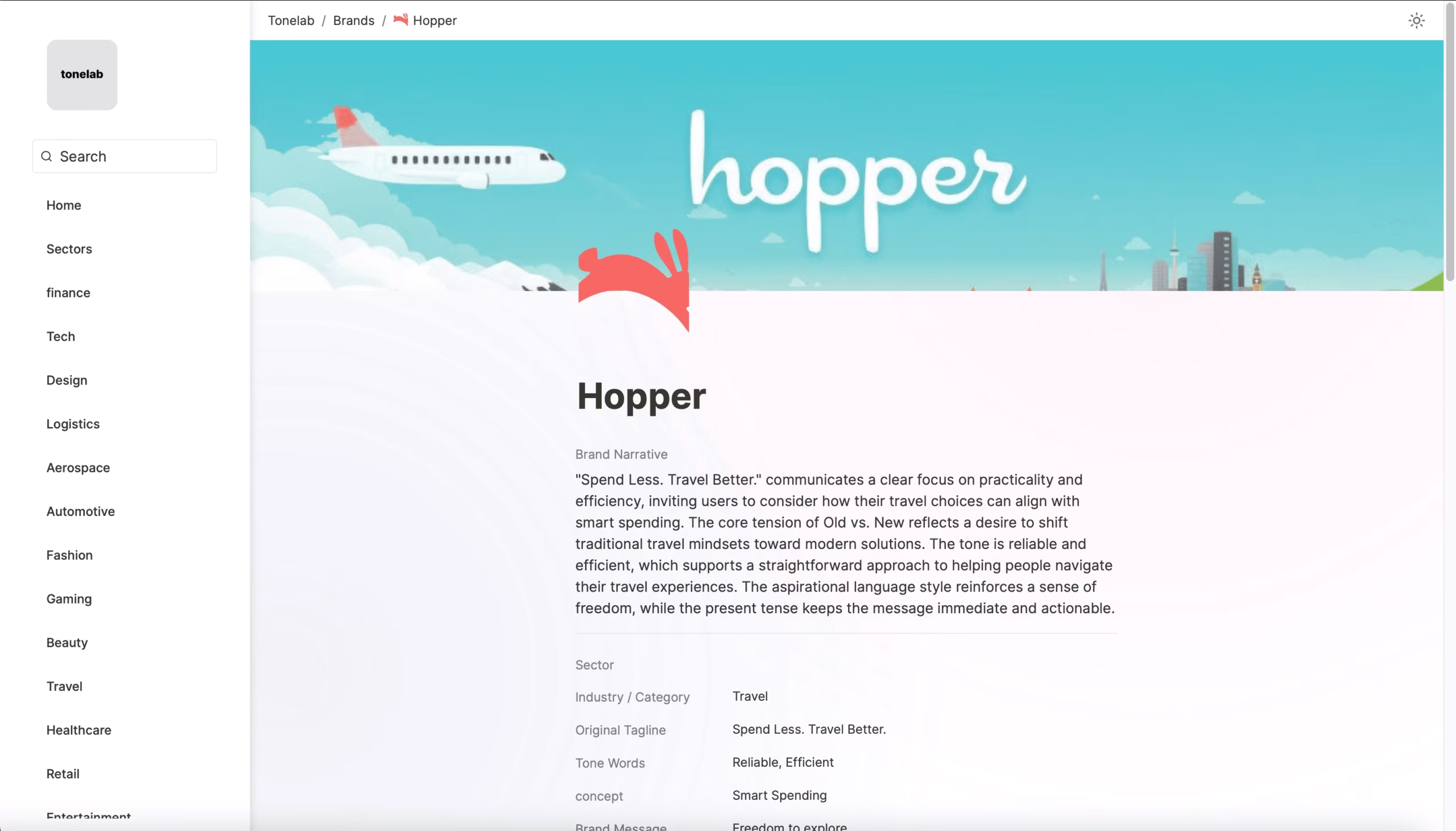
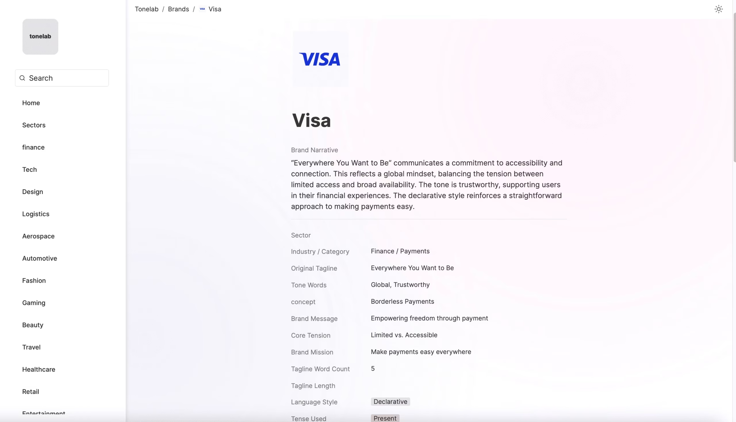
WHAT’S IN EACH CARD
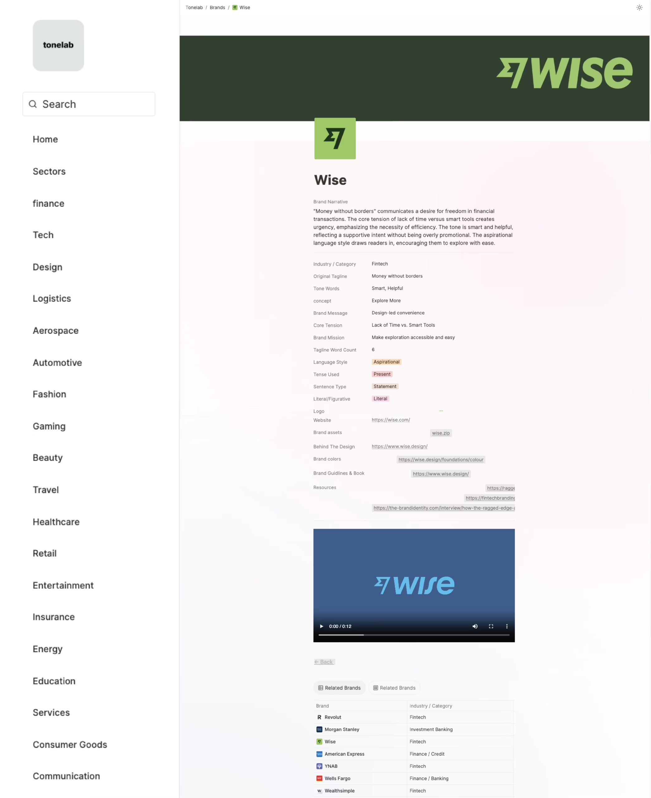
- Industry they’re in
- Their tagline
- Tone Words
- Concept
- Brand Message
- Core Tension
- Brand Misson
- Tagline Word count
- Language Style
- What style they use
- Present or future tense
- Statement, question, or command
- Logo
- Website link
- Brand colors
- Brands Assets Downloadable
When available:
- Guidelines (if they’re public)
- Some additional resources ( marketing + strategies + identity + articles )
NAVIGATION & FILTERING
Filters so you can find what you’re looking for:
- Browse by industry (Tech, Finance, Gaming, etc.)
- Filter by tagline length
- Filter by sentence type
- Filter by tense used
- Table of Brands
- Language Style
- Tagline Length
- Sectors
FEATURE DEMONSTRATIONS
Navigation :
Table of Brands
Browse all brands in one view from the home page. Sort, search, and click into each.
Sector Navigation
Jump between sectors to explore grouped brand types and industries.
industry Navigation
Navigating through industry
Filtering Options
Tense Used Filters
Filter taglines by the verb tense used Present, Past, Future, or Present Continuous.
Sentence Type
Filter taglines by structure ,Command, Statement, Question, or Noun Phrase.
Tagline Length
tagline length filters from the homepage
Resources section :
Brand Guidelines
View and download official brand guidelines like tone, usage, and colors.
Brand Assets
Download logos, visuals, and asset packs from brand pages.
Challenges
No structure at first – I started with brands in one row, taglines in another, then missions, but when I got the idea to actually build something with it, I got anxious about where to start. It was just for personal reference at first, so I was collecting taglines, tones, missions, and other notes without any clear format. Helpful for thinking, but messy to work with.
Balancing usefulness without overcomplicating it – I wanted to include enough details to make it meaningful, but not so much that it became overwhelming. I considered going deep into strategy, adding breakdowns or case studies for each brand. But at some point, I had to stop and just get it out. Maybe I’ll add those layers later.
Shifting from private to something I could share – It began as something personal, just for my own research. But eventually I wanted to present it in a cleaner way, so others could browse through it more easily.
Turning Notion into a website – After building everything inside Notion, I looked for a way to make it public without rebuilding from scratch. I found Super.so, which basically uses Notion as the backend and gives you a simple way to shape the front-end. It helped make the layout feel more like an actual reference site.
The name – I kept thinking about what this whole thing was actually about: tone, messaging, communication. So I landed on Tonelab.
A library where you can browse through brands for inspiration